The goal of any human-machine interface (HMI) should be to make tasks efficient and user friendly. In the past 10-15 years, there's been a shift in HMIs from task orientation to usability/user experience. Just as mainstream users get error messages like "this password doesn't meet requirements,” but have no idea what the requirements are, and get unhelpful feedback, industrial operators trying to work on their HMIs face similarly frustrating issues. Consequently, HMI designs that include end users and operators have a higher probability of success and can reduce these frustrations.
Engineers and designers can get stuck trying to make solutions that look "good" to them and their view of the world, but what does good look like? This can be relative and subjective, especially when people aren't on the same page. Engineers focus on making products technically good, but this may not always meet the needs of a paper machine operator, who needs a simple way to do his job efficiently. Starting an HMI design from scratch can be a daunting task—one may not know where to begin, and overwhelming research results and available methods can be misleading.
Humans are also prone to making mistakes. We need to understand there's not a perfect human, who makes no mistakes, nor will the system they use never pose any issues. The goal of a safe and reliable HMI should be to handle errors and make the system failsafe, so when issues do arise, they're dealt with in a failsafe manner where no one gets hurt. Focusing on user needs and expectations, including those on the front end of the design, has a huge impact on accounting for potential issues.
Design considerations
Psychology plays an important role in HMI design. Even though people are unique and think differently, humans have inherent characteristics that drive certain behaviors, and understanding these nuances can help navigate HMI designs. For example, an e-stop button should be placed in a top left corner of screens in North America, where our eyes generally scan left to right, top to bottom, so information in the top left corner is noticed quickly.
Human-centered design should be implemented for HMI design, and as part of this, co-design including the operations and management teams ensures a well-rounded design. Involving users early helps build trust, and results in stronger designs. Designing for usability and accessibility ensures that HMIs can be used by a range of people, including those with visual or cognitive disabilities. Accessibility also means incorporating the needs of other users, including those from different cultures and countries.
Empathic design is crucial to an effective HMI, which should be designed and structured for end users, not the engineers who designed it. There are various resources that can produce efficient HMI design and improve usability/user experience. One classic reference is the "Eight Golden Rules of Interface Design" by Ben Shneiderman, a computer scientist and professor at the University of Maryland's Human-Computer Interaction Lab,1 which can be applied to HMI design:
- Strive for consistency. Consistent sequences of actions should be required in similar situations; identical terminology should be used in prompts, menus, and help screens; and consistent commands should be employed throughout. In an HMI, this means applying the same navigation structure throughout the project, and maintaining consistency of buttons and behaviors through the HMI.
- Let frequent users use shortcuts. As frequency of use increases, so do users' desires to reduce interactions and increase pace of interactions. Abbreviations, function keys, hidden commands and macro facilities are helpful to expert users. In one HMI project, Forward and Back buttons were used for the next and previous screen changes.
- Offer informative feedback. For every operator action, there should be some system feedback. For frequent and minor actions, the response can be modest, while for infrequent and major actions, the response should be more substantial. For example, when an operator tries to start a motor with a Start button, but there's a communication issue delaying startup, feedback such as "Waiting for input" or "processing" gives feedback on the button press.
- Design dialog to yield closure. Sequences of actions should be organized into groups with a beginning, middle and end. Informative feedback at the completion of a group of actions gives operators the satisfaction of accomplishment, a sense of relief, the signal to drop contingency plans/options from their minds, and indicates the way is clear to prepare for the next group of actions.
- Offer simple error handling. As much as possible, design the system and HMI, so users can't make serious errors. If an error is made, the system should be able to detect the error and offer simple, comprehensible mechanisms for handling it. A message stating ‘XD097Xd error!’ isn't useful; a message saying, "Restart the application due to system error" is more beneficial.
- Permit easy reversal of actions. This relieves anxiety because the user knows errors can be undone, which encourages exploration of unfamiliar options. The units of reversibility may be a single action, a data entry or a complete group of actions.
- Support internal locus of control. Experienced operators strongly desire the sense that they're in charge of the system and that it responds to their actions. So, design the system to make users the initiators of actions, rather than responders to it.
- Reduce short-term memory load. The limit of human information processing in short-term memory requires: keeping displays simple, consolidating multiple page displays, reducing window-motion frequency, and allotting sufficient training time for codes, mnemonics and sequences of actions.
Involve and empathize
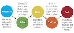
Human-centered design must involve users in all phases, but there are different ways to elicit information from them. To empathize with users, HMI designers can use various methods, such surveys, interviews and affinity charts. These help narrow and define requirements, and lead to the ideation process (Figure 1). It's crucial to not jump on the first design idea—and think like a designer, not just an engineer. A diverse user testing group also plays a huge role in defining user requirements. For example, 10% of the population is color blind on average, so if an HMI is designed with reds and greens, its color coding could render it inaccessible for some users. To design for inclusiveness, one needs to understand users' needs, and test proposed interfaces with a variety of them.
Figure 1: To design effective HMIs, designers must involve users early, empathize with them, and secure their input using various methods, including surveys, interviews and affinity charts, which help narrow and define requirements and lead to the ideation process.
Interviews and surveys are a good way to collect data and information from users. Interviews may also be followed up with a detailed survey, which can get more information, and also document the evolution of HMI design from one system to another. It's imperative to not use a complex survey that can't gain any input. Some considerations to keep in mind while designing a survey for an HMI design include:
- Use simple language and examples if needed. For example: “Does it return to higher level menus with only one button click? (How many clicks to get to overview screens?)”
- Mix up questions to break up the monotony! If the survey asks for detailed answers for all questions, the likelihood of the user completing all of them is low. Creating a mix of Y/N questions and some requiring more detailed input will yield better results.
- Questions that may require detailed answers that may span more than a couple sentences should be treated as interview questions. One-on-one interviews give the user a chance to tell their story in detail, with less chance of miscommunication.
Surveys with a follow-up summary are a good tool, but may not provide the same qualitative data as interviews. Interviews provide rich qualitative data, and surveys are more useful to provide quantitative data. Initial interviews with the operators on the machine showed the inconsistency within the HMI system, and brought forward opportunities for improvement that were needed to improve performance. Understanding what the user needs—not just what they want—can be a challenging process. It's beneficial to have a complete understanding of the process, so you can ask more challenging, thought-provoking interview questions.
Usability surveys can be useful in determining if there is a certain aspect within the HMI that needs more work than other aspects. Surveys can not only be used during initial design stages, but can also be used later to track HMI system performance and user experience (see sidebar).
Affection for affinity
Beyond surveys and interviews, human-centered design requires observation and gathering insights because there's usually a disconnect between what people do and what they say. Observing operators shows designers how to make HMIs more efficient and user friendly. During the observation stage, we noticed an operator switching between three screens to complete one task that's repeated at least twice daily. This operator was so acclimated to switching screens that it'd become a repetitive task for him. During the HMI redesign, these observations were accounted for, and the new screen halved this task's completion time.
Collecting observations and insights for HMI design can also be done with the help of an affinity chart or diagram, which organizes ideas, opinions and issues during brainstorming, and organizes them into groups based on natural relationships. They're built from the bottom up into a meaningful structure, which forces designers to deal with each field observation, and think about what it tells them about the user’s world. This produces one hierarchical structure that tells the story of the issues across the whole user population when read from the top down.
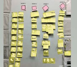
This method works well to bring out ideas for organization, and group different observations into a structure that made sense for the operators. After going through this process with numerous operators, a pattern emerged—all of them had very similar affinity charts. This affinity chart in a paper mill (Figure 2) portrays the process created by discussions with operators, and shows the grouping of the HMI with a focus on tasks and actions, instead of focusing on machines. Many operators were initially skeptical about the process, but as the affinity chart was formed, they were surprised at the different structure for the HMI and screen organization. Initially, they attempted to group all their tasks in each machine area, but after they reassessed, the structure for the various tasks was grouped by modes of operation.
Figure 2: This affinity chart at a paper mill shows the process created by discussions with operators, and demonstrates the grouping of the HMI with a focus on tasks and actions, instead of focusing on machines. It showed that, for an operator to complete one task, he must go through six different screens. With a new hierarchy, those six different settings/actions could be grouped on one screen.
For example, start-up tasks would be different than monitoring or troubleshooting tasks. Currently, Task A, Task B and Task C in Figure 2 are on the same area on the machine, and are grouped together. However, for an operator to complete one task, he must go through six different screens to be able to complete it. With the new hierarchy, the operator realized those six different settings/actions should be grouped together on one screen that can complete the task/action.Responses to this affinity diagram included, “I never saw the HMI arranged this way!” and “This makes so much more sense. We shouldn't need to go change the draws for the wires on four different screens” and “This is different.”
Inclusion enables HMI design
Training and continuous improvement plays an important role in the success of an HMI project. People can be resistant to change, and it can be hard to transition from a 15-20-year-old HMI system. In this rapidly changing world, we need to learn quickly. The biggest advantage of involving users upfront is it ensures the training and implementation phase moves seamlessly. When the user is involved upfront, all their ideas are considered during the design process, which also helps drive the design. It also gives the user a sense of ownership towards the final product which leads to a seamless transition. People work towards things they care about, so it's imperative to involve users from the beginning. Also, user feedback on testing shows if an HMI design meets their requirements. The designer has to plan, check and adjust through the lifecycle of the project, and this feedback loop also ensures more successful HMI designs.
People are different; everyone learns and interprets things differently. Understanding the psychology behind how people think and behave, and factoring those pieces in an HMI design improve the project's probability for success. Nachreiner, et. al., states, "There's a demand for immediate action, i.e. for applying human factors knowledge in process control system design, for a professional evaluation of human factors in process control systems, and for research on possibilities of using new technologies that assist operators in controlling process control systems."2
User input is important for HMI designs, and improve performance and usability for a HMI system. Applying different design techniques and soliciting user input at different stages of the project is beneficial, and the implementation is more seamless, than introducing a brand-new system they've never seen or used.
Designers may not know every user, but they can develop inclusive practices to create experiences that support a wider range of people, most of the time. Inclusive design forms the bond that creates a more usable interface for the users. This also plays a role in safety, as the psychology or the users is taken into consideration while designing a failsafe system.
In conclusion, usability plays a huge role in HMI designs. Building a product for the user is not about how well the product works, it’s about how well the user can use the product to solve the problem. Similarly, within HMI design, when the interface design is usable and user oriented, the operators will have a superior user experience that would enable them to complete their tasks in an efficient manner.
1. Consistency in naming, pictures and process flows? Overall consistency?
a. Is color coding consistent?
b. Is the display format and symbol consistent?
c. Is the feedback consistent? (appears in the same place and similar manner)
2. Feedback—do you receive timely feedback that makes sense?
3. Error messages—if something isn't working right, how well is that displayed or conveyed?
4. Flexibility
a. Does it allow for flexible control?
b. Does it have good training for different users?
c. Can users customize windows?
d. Does it allow for zoom functionality?
5. Is ordering of menus and navigation logical?
6. Are the names/command names meaningful?
7. Is shifting between windows easy?
8. Does it return to higher-level menus with only one button click? (How many clicks to get to overview screens?)
9. Is guidance information always available?
10. Does it provide hierarchic menus for sequential selection?
11. Is the data highlighted?
12. Is there a clear distinction between different types of displays, like inputs versus labels?
13. Does it provide an index of command?
14. Does it indicate current position in menus structure?
15. Are display elements distinctive?
16. Are there easily distinguished colors? And visually distinctive fields?
17. Is the screen density reasonable? Is it cluttered or is there too much whitespace?
18. Is help provided? (on Q10)
19. Is there a cancel button? Will it be useful?
20. Do we want an undo button?
21. It helps you be effective.
22. It helps you with productivity.
23. It gives you more control?
24. It saves you time and does everything you want it to do.
25. It's easy to use.
26. It's simple enough to use and understand.
27. It's user-friendly (leads to happy users and user satisfaction)
28. It requires fewest numbers of steps to accomplish what we want to do.
29. I can use it without written instructions.
30. Both occasional and regular users would like it.
31. I can recover from mistakes easily.
32. I learned to use it quickly.
33. I easily remember how to use it.
34. I'm satisfied with it.
35. I feel wonderful and happy after using this.
36. It's easy to read and comprehend what's written on the screen.
Footnotes
- "Schneiderman’s Eight Golden Rules Will Help You Design Better Interfaces," Interaction Design
- Nachreiner, Friedhelm (2006), "Human factors in process control systems: the design of human-machine interfaces," Safety Science
References
- Holtblatt, Karen; Beyer, Hugh (2016), Contextual design: design for life, second edition.
- "How to Design Effective HMIs," Control
- Klein, Gary (2013), Seeing what others don’t: the remarkable ways we gain insights.
- Hollifield, Bill, Oliver, Dana, Habibi, Eddie, Nimmo, Ian (2008), The High-Performance HMI Handbook.
- Meyer, E. A., Wachter-Boettcher, Sara (2016), A book apart, design for real life.
- Lambert, Steven, "Designing for accessibility and Inclusion"
About the author
Nadita Gupta is a process control engineer at Georgia Pacific. She can be reached at [email protected].
Latest from HMI

Leaders relevant to this article:


